Dominik Roth
3b209e743e
Dominik Roth
3b209e743e
Several rounds of actually looking at the running app instead of just
the code, in order:

- The icon-only shell button on a firing card, and the popover-based
  picker, both fought a genuine GTK sizing quirk: Gtk.Picture's natural
  size is the source image's full native resolution (512x256) no
  matter what set_size_request() says, so the button's own requested
  size swung unpredictably depending on layout context (sometimes
  comically wide, sometimes squeezed tiny). Fixed by pre-scaling the
  actual pixel data with GdkPixbuf first (preserving real aspect ratio)
  and wrapping the already-correctly-sized result, nothing left for
  the surrounding layout to guess about.
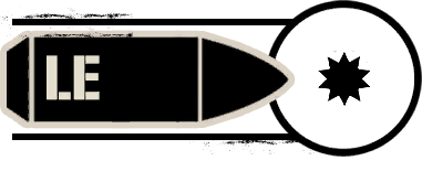
- The shell icon PNGs themselves carry a lot of built-in transparent
  padding around the actual artwork. Cropped all of them (except MSTD,
  see below) to the same shared bounding box, computed as the union of
  every file's real content so nothing gets clipped and every icon
  stays aligned the same way.
- MSTD (mustard/YX blister agent) removed from the Shell enum entirely:
  its own game icon is stamped 'UNAVAILABLE IN DEMO', it isn't actually
  a real selectable shell in the game.
- Extra empty chrome around icon-only buttons turned out to be GTK CSS
  specificity, not a missing property: GTK's CSS has no !important at
  all (confirmed, its parser rejects it outright), and separately,
  Gtk.MenuButton's CSS node is literally named 'menubutton', not
  'button', so a 'button.<class>' selector silently matched zero
  elements on it. The actual leftover padding lives on MenuButton's
  internal child button node, reached with a child-combinator selector
  ('menubutton.<class> > button').
- The Add Strike dialog's shell picker is now an inline radio-style
  grid (build_shell_grid(), Gtk.ToggleButton.set_group()) instead of a
  button that opens a submenu popover: it's a 'pick one before
  proceeding' dialog with room to just show every option up front,
  hiding them behind an extra click didn't earn anything. The firing
  card and its tighter row still use the popover version.
- Grid is 3 columns (was 4), sized bigger now that padding is real
  content, not just empty canvas.

Also two unrelated but real bugs found and fixed while chasing this,
from actually reproducing what screenshots showed instead of taking
them as pure cosmetic complaints:
- Selecting a firing card shifted every icon/label inside it inward by
  2px: only .firing-card-selected had a border, unselected cards had
  none at all, so gaining a border on selection shifted the box's
  content instead of just changing a color. Border is now reserved at
  the same width on every card, always, selection only changes its
  color from transparent.
- Changing a target's powder charge visibly shifted the whole card:
  the charge segment buttons had no valign, so once the row got taller
  (the bigger shell icon next to them), they silently inherited the
  default FILL alignment and stretched into ovals instead of staying a
  fixed circle. They also relied on plain 'flat'/'suggested-action' for
  their off/on look, which draws no border at all when off, making an
  unselected segment invisible against the card background. Both fixed
  with a dedicated fixed-size, always-outlined CSS class and explicit
  valign/halign=CENTER.
- The AZ column's screen position depended on the ELEV value's digit
  count (elevation recalculates per charge picked), fixed with a
  reserved width_chars on the elevation label.

Verified at each step by actually rendering the affected widget/dialog/
card to a PNG and looking at it (including a real FiringPanel card
before/after a charge change, pixel-diffed to confirm nothing but the
intended fill state moved), not by reasoning about the code alone.

Co-Authored-By: Claude Sonnet 5 <noreply@anthropic.com>
17 KiB
381x155px
17 KiB
381x155px